Tuesday, 27 September 2011

OUGD201 - Design Production - Print. Good is? Rational


OUGD201 - Design Production - Print. Good is? Rational

Minimalism - what is minimalism? how minimalist can you be..

Good is.. minimalism.

Background.
Minimalism has become massive recently, every logo/branding, advertisement, package design, publication even modern technology, such as apple products are becoming more and more minimalist. Minimalist is good because is it cleverly communicating message or selling a product using the most minimalist techniques as possible usually using wit or genius puzzling ideas. 

Aims.
- to produce book using minimalist publication and editorial and including some on my own minimalist work.
- explain why minimalism is good and what is minimalism including illustration minimalism quotes all published using minimalism.
- to test the boundaries of minimalism showing how face you take it whist still be legible and still communicate a message.
Audience.
This product is aimed towards people who work in design center. The product is ment to inform and entertain people. People who want to know what minimalism is or want to see some minimalism/publication.

Deliverables.
Deliver a professional looking using a range of printing methods.

53rd international art exhibition: making worlds - publication


“The Venice Biennale is the worlds most exciting visual arts event that takes place once every two years in Venice, Italy. The 53rd International Art Exhibition, curated by Daniel Birnbaum, comprised works by over 90 artists from all over the world. The assignment was to create a new strong visual identity that would communicate the theme‚ Making Worlds. The visual identity should both reflect the atmosphere of the Art Exhibition, keep all activities together and create an extraordinary interest.”
The assignment was to create a strong visual identity that would communicate the theme of the 53rd venice biennale: making worlds. Stockholm design lab combined elements from something truly universal - all the flags of the world - and created something new. It resulted in the making of worlds with abstract forms.
bas fontein - minimalist publication

When Bas Fontein tells someone that he is an artist, people tend to give him unrequested advice about how to make money from art. He collected these quotes and turned them into a pocket-sized book titled Wat Te Dieb (what to do). Most striking in the design are the flourescent colour and thick underlining.


sikkens foundation - publishing/editorial.

Programme and invitation for the awarding ceremony of the sikkens prize held in Rotterdam. Showing great use of type layout to create these really striking editorial pieces. The colours used varying from yellow to magenta using dots to give a half tone style and gives the sensation of gradient.
Really like the way the text is offset slightly from the edge of the blocks of colour.


cross section studio - minimalist branding

Minimalist logo design with business cards and documents following a similar minimalt theme, using only black and white and fitting to a grid system giving it a really professional crisp look.


Monday, 26 September 2011

Lura - smart publishing


Really like the layout used within this magazine, expecially on the middle page using just black and white with blocks of text gives the magazine and modern.


Siggi Odds - printing on metal, also really smart illustrations.

Designer Siggi Odds (Sigurður Oddsson) was born in Iceland but grew up in Vancouver! Really like his illustrative style not really related to the style im looking at because it certainly isnt minimalist however in one of his pieces he printed onto a large metal sheet which is something i havnt seen before and i thought the effect it had was really nice, contrasting a really crisp colourful design with a dirty metal sheet really makes the illustration stand out.


Julie Joliat - minimalist publishing.

“Agenda 2011″ by Swiss designer Julie Joliat. It contains more than 50 connect-the-dot puzzles revealing famous art pieces, and a whole slew of other useful things like a wine chart.
I really like the publishing techniques used here, minimal colour, minimal words, just simplified design which works really well throughout the publication, also combined with a clever idea makes the book really stand out. 


DJPA Partnership - packaging and promotion

The aim of this was to headhunt outstanding creatives as well as promoting its own business by using the company color orange. . The CD/media kit packaging was made from thick cardboard found at a dump, a rubber band, and a painting brush dipped in orange paint.


Anthony Burrill - Wilton's Music Hall

Using letterpress printing techniques Anthony Burrill created this design to raise money for Wilton's Music Hall with hand made prints of his work selling for £50 each, I really like the effect letterpress has, such a clear crisp professional finish and is something i've always wanted to try, looks pretty complicated setting it up, getting it rights and everything, gunna hopefully give it a try some time soon, maybe not for this brief but and up and coming one.


Tent London show directory - publishing

Each page of this has been printed on the same print paper used by the FT, nothing special however the minimal colours used and the odd combination of pink and black gives the magazine a really interesting and unique look.


Parra x David Burel Headphones - branding

Really nice clever headphone design, illustrations printed onto wood.
Im not actually sure how this technique was carried out however the overall outcome works really well having bright colourful illustrations wood.


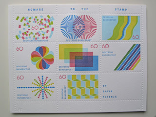
Beautiful stamp designs by Gavin Potenza

Letterpress print, printed by Providence's DWRI Letterpress. The artwork has been printed on an archival 250gsm Somerset Radiant White print making paper. Contains four overlapping transparent print layers and one blind debossed layer. I really like the effect this technique has, the colours have turned out really nice along with the slightly embossed edges gives the stamps a really nice finish, think im definitely going to be trying this technique within my outcome/experiments.


Marian Bantjes - I Wonder, packaging.

This gorgeous old fashioned book uses a range of printing techniques throughout it, foil printing, embossing which gives the book a really stunning, eye catching finish.


Cinéma du Parc - PETER CRNOKRAK

This three-part series of promotional posters showcases Cinéma du Parc’s special screening of politically charged auteur films from the 1960s. These posters use a printing technique called lambda printing which is different because its transfers images directly from computer-generated digital files to reflective or backlit photographic materials without the need for a negative, then material is then processed in the same manner as traditional photography, by developing it in a wet film processor. This gives the poster a really crisp clean finish with a clear high quality finish even when printed on plastic.


Turnbull Grey - Showthrough Posters

Posters printed double sided on lightweight 60gsm paper. Red reversed out text on reverse shows through from the front. Accentuated by light box mounting. It 's a pretty clever idea however i feel it could of been executed allot better, wouldn't really be appropriate using this technique for the style of outcome which i plan on making however it would be nice to see what i could do using this approach at some point, maybe improve it slightly


20/20 - exclusive diamond club brochure. Publishing editorial


I found these examples of clever use of print in this book by Scott Witham called, 'print and production for promotional items'. I couldn't find these images on the internet anywhere, had to take photographs of them so sorry for the low quality. These are the rebranding of the Arsenal exclusive diamond club members lounge brochure. The brochure is designed to emulate the look and feel of a diamond club members lifestyle. Using embossing, blind embossing and foil blocking to give the brochure a really crisp look and adds clarity. I really like the effect the foil blocking has and wouldn't mind trying it one day.