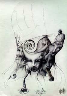
i really like the work of david fold, i have been looking at his work allot recently, i like the way he is able to portray allot of emotion and detail in his work using very limited colours, the way he work only usually consist of 2 colours, usually dark, grey tones gives the illustrations a really gloomy, depressive tone contradicted by the strange magical imagery he draws.
Within this illustrators work i like the use of linear, how everything is built up from sketchy lines with no limited tones and colours used, give the work a really nice look, hopefully something i will try in the future to develop my illustrative skills.
Chelsea Greene are really stunning the amount of detail gone into each one is really amazing, one of the things i really like about chelsea's work is the colours used, she doesnt tend to use strong bold colours, instead uses soft suttle natural tones making her work look even more elegant. The way she illustrates these are similar to the next artist just building up loads of swirls and lines ontop of each other almost to the extent of having alittle too much going on within the image however it works really well.
Jach Johnson of zenvironments is probably my favourite illustrator at the moment, his work is really breathtaking, on his website he has this ongoing illustration which going on for pages and pages, takes like 5 minutes just to load all of it, of just sketches and drawing piled up on each other to create these really stunning pieces, which he just keeps building up and it gets longer and longer all the time. What i really like about the way he works is his sketchy style, using different pen thickness' on top of each other to add tone to the drawings even thought they are mainly linear.
Georgina Luck
jakob klug
jacob klug, not really graphic design however he has been one of my favourite illustrators for along time now, as with allot of the illustrators i like the thing i really like about his style is the ways he is able to just build up random sketchy lines to create an image and it is something with i have tried to apply to my illustrative technique, using rough sketchy lines create the designs.
Mr bingo
I really like mr bingos linear style, he draws his illustrations which seem to be all proportionally correct with perfect realistic detail however with the use of linear lines gives it a really unique cartoony style.


No comments:
Post a Comment