Black Umbrella Branding and Identity
The client envisioned a sophisticated identity and branding package. We created a strong minimal logo which can be combined with an intricate pattern. This system was then applied to the stationary and website.
Thursday 27 October 2011
Tuesday 18 October 2011
minimal publishing and editorial
- The sign
The Sign is magazine of solely interviews with the aim of exploring the world of contemporary art, design, graphic and architecture.
I didnt actually like the layout and editorial of this magazine, was far too messy with too much going on and just colour everywhere, looked really cluttered and not crisp.
However i did like these first two pages, i liked the effect the big red parallelogram layered over the photograph has and slanted text on the next page in the same shape with nothing else on the page.


minimal publishing and editorial
Nouvelles Ruines - La cité des Minimes
Great use of type and layout in the book, the typeface used works really well, kind of contrast between the old black and white images and the dirty off-white stock and the modern use of type and minimal layout. So simple yet brilliant.
Another thing i like is how the cover is repeated two pages down, gives the book a really minimal feel and is something ive not really seen before.


minimal publishing and editorial
Modus Magazine
Reactions to the deeper sounds of Dubstep and Techno.
Modus magazine covers the deeper sounds of dubstep and techno.
The music is minimal and soulful, the design aims to reflect this.
Really like the colour theme running though this magazine, the cyan blue on the off-white stock works really well and is something i've been using allot recently.
The front cover of the magazine is brilliant, so simple but still looks great.
Also the double page spread with just type running from left to right is very minmal and very nice, maybe something i might try within the editorial i create.


minimal publishing and editorial
LQ magazine
Another piece of minimalist editorial which caught my eye, really love the cover of this magazine, so simple yet elegant, with subtle use of colours however still allows the design to really stand out, overall love the simplistic and elegain layout style.


Another piece of minimalist editorial which caught my eye, really love the cover of this magazine, so simple yet elegant, with subtle use of colours however still allows the design to really stand out, overall love the simplistic and elegain layout style.


minimal publishing and editorial.
- XL vs XSXL Pencil vs XS Pencil
- The objective of this project was to create 4 pairs of pencils that would resemble something XL and XS, be it through graphic patterns or modeling of the pencil itself.Really clever book which really illustrates the message behind it using clever type layout and editorial, using large bold fonts and heavy pages to illustrate the fat pencils and minimal editorial and page designs with the small pencils.The use of typography within this book is gorgeous, each typeface used works really well along with the layout of the type further maximalises the effect that it has. The pages which really caught my eye are the ones with the beard illustration on, they are soo minimal but yet their is still so much going on on the page, with just the illustration in the middle of the page surrounded by white space sounds really simple but the effect it has is really beautiful.


minimal publishing and editorial
This research explores The National Palace of Culture's signage system.
Its different elements are documented, selected and organized in order to reveal
the system's logic and its relation with the rest of what is called "The Palace of Culture''.
This design is really interesting really good organisation and layout of type and image in a retro style.
The stock used works really well also the off white stock with the greys and minimal colours used throughout has a really nice effect. I also really like the layered nature of this. It's simple on the exterior, and very detailed once you look deeper.


minimal publishing and editorial
MB brochure
Raimon Bragulat (Art Direction), Oscar Espinosa (3D), work made for ah!men.
I really like the colour scheme used throughout the book, black and pink isnt something you see very ofter but it works really well. The thing i liked about this book is the type layout out on top of the image, really makes the type stand out works really well. The type faces used throughout the book is great aswel, even though it changes quite often each typeface works perfectly.


minimal publishing and editorial.
SUHA Annual Report 2009.
For the fourth consecutive year, WILLOW has designed the Annual Report for the South Ulster Housing Association. This year the design encompassed a unique typeface by renowned Barcelona-based graphic artist Alex Trochut.
The type design here is brilliant, so detailed yet still has a minimalist feel with the page layout.
Would love to see the whole book but i cant see any more information on it, the editorial used within the book isnt too great with the type and page layout especially on the black and white page.


minimalist publishing and editorial
Slow traveling, the book
Designed by Astrid Ortiz.
I really like the cover design for this book so simple but reflects the concept perfectly, embossing is definitely a print finish i would like to include somewhere within my outcome, probably used in a similar style to this nice and minimal but really effective. The rest of the book however im not too keen on, the layout is nice with the different arrangements and the type choice and colour is spot on, works really well. However the photographs, even though it works really well within this book its just not minimal enough, with a photo taking up the whole page.


Minimalist publishing and editorials
Information - in formation
Publication by Christian Grutsch,
I've been obsessed with publishing and editorial recently, especially the minimalist editorials,
The layout of type in this publication is brilliant, the way he has a flowing style through the whole book with the type and images in the same place on every page works really well, works really well as a piece of publishing however if i was going to do something similar to this for my outcome i think their would have to be allot more content, a range of minimal typography and illustrations followed with clever type layout. Also i dont feel the cover works well, even though it is suppose to be minimal i feel their could of been allot more going on, maybe lay the type slightly different even a different typeface would of improved this dramatically.
The layout of type in this publication is brilliant, the way he has a flowing style through the whole book with the type and images in the same place on every page works really well, works really well as a piece of publishing however if i was going to do something similar to this for my outcome i think their would have to be allot more content, a range of minimal typography and illustrations followed with clever type layout. Also i dont feel the cover works well, even though it is suppose to be minimal i feel their could of been allot more going on, maybe lay the type slightly different even a different typeface would of improved this dramatically.


Monday 17 October 2011
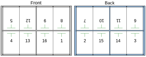
What is Design for Print? imposition
imposition is used in mass produced print, it is the arrangement of a publication's printing in the sequence and position that they will appear when printed. It provides a visual guide where you can easily see what page goes where before being cut, folded and put together in the correct order.

This plan shows a 16 page print which will be printed double sided and folded to create a 16 page section. The imposition allows a designer to see what stocks and colours are used where and how they can be used to maximum effect.
This plan would be used on things such as magazines, publications and booklets.
Subscribe to:
Posts (Atom)


