Monday 21 November 2011
Sunday 20 November 2011
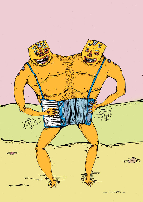
minimalist illustration - Josh Brill
For this collection, he went on creating animals commonly found in Africa and as you can see, they are gorgeous. I think this simple yet effective art style can fit children’s and adult’s rooms alike, it is such a timeless set of artworks that I would like to have. Using simple shapes to build up an illustration seems to work brilliantly has a really nice effect, also using different tints of the colours to add shading to the animal seems to work really well also.


what is print, lithography and CTP
The lithography printing process is simply where a treated metal plate is used to transfer a design via a rubber blanket to stock.
Lithography is a high speed low cost print process which produces constant clean results, perfect for printing things such as leafter, magazines and newspapers.
Lithography is a high speed low cost print process which produces constant clean results, perfect for printing things such as leafter, magazines and newspapers.
what is print, duplexing.
duplexing refers to the bonding of two substrates to form a single one.
Gives a really interesting finish to a design with the stock to have two different colours, textures and finishes. Also if you lay 3 stocks ontop the same on the top and bottom with a thicker coloured stock in the middle, it gives a really nice layered effect to your substrate with the width being a different colour to the stock. like here...


Gives a really interesting finish to a design with the stock to have two different colours, textures and finishes. Also if you lay 3 stocks ontop the same on the top and bottom with a thicker coloured stock in the middle, it gives a really nice layered effect to your substrate with the width being a different colour to the stock. like here...
Saturday 19 November 2011


minimalist typograpgy
designedbyfamily design studio.
Designbyfamily is an award winning graphic design studio, providing a unique and different approach to sectors such as music, fashion, culture and the arts. John was the one who told me about this design studio, the typography and compositions they do here are so crisp. Especially like the 1984 one, the colours the dark grey on light grey work so nice together, just the whole composition, its so simple yet really nice, im thinking some typography like this would work verry well within my book.


Designbyfamily is an award winning graphic design studio, providing a unique and different approach to sectors such as music, fashion, culture and the arts. John was the one who told me about this design studio, the typography and compositions they do here are so crisp. Especially like the 1984 one, the colours the dark grey on light grey work so nice together, just the whole composition, its so simple yet really nice, im thinking some typography like this would work verry well within my book.
Friday 18 November 2011
minimalist compositions
Tereza Cenic
A set of minimalist posters to promote a website for eye tests, with no text on allot of the images, some of them are hard to understand straight away however still the minimalist style and layout still looks really fresh. All made up of simple shapes and no more that 2 colours just different tints.
Each one of these works really well could be very influential within my designs.
Tuesday 15 November 2011
illustration.
'Unknown artist' - Archetypes.
I couldnt find the name of the artist who designed these. Archetypes is a project that i came across the over day, using geometric shapes and illustrations of animals to create interpretations of different animal archetypes with minimalistic and simple compositions.
Really like the concept behind these illustrations, contrasting really detailed illustrations with minimalist compositions, one thing i think really works well is the using complete grey scale but having a random brightly coloured shape layered ontop of the illustration, simple idea but works really well in making the design unique and stand out.
Monday 14 November 2011
Minimal illustration
Bo Virkelyst Jensen
Designes created for posters and tshirts.Not really too keen on the illustration style used here however it is helpful looking at this work to help try to look at animals are illustrate them as minimalist as possible. The style is alittle poor however the concept is great and very relevant to what i hope to do. Creating animal illustrations as minimalistic as possible.

minimalist illustration
Alexey Carlove
Some of these animals are very cleverly put together such as the hedgehog and the lion at the bottom, kind of getting across the point i was hoping to make with my project, making illustrations still legible whilst using as little elements as possible, only showing what needs to be shown. Therefore this is a great starting point of something to help illustrate some of the animals that i wish to include within my book, hopefully however try to make them even more minimalistic.

minimalist illustration styles.
Luis Domingo - Geometric Animals
Animals made out of simple shapes, really nice minimalist style, building up animals with different shapes.
I feel it could of been slightly more minimal though, maybe would of worked better building up animals only geometric shapes like squares and circles, their is a few animals with unnecessary detail. Working with this style could work very well within this project, however working allot more minimally.
I feel it could of been slightly more minimal though, maybe would of worked better building up animals only geometric shapes like squares and circles, their is a few animals with unnecessary detail. Working with this style could work very well within this project, however working allot more minimally.


illustrators - murray summerville
Murray Summerville
Murray Summerville is a freelance illustrator from Dildo. I only noticed this guys illustrations a couple of days ago at while working at sainsburys stacking the shelves. He has redesigned the new becks bottles with this really unique illustration, really makes the beer bottles stand out from all the other. Its really clever because the bottle no longer has the becks logo on the front, or any information about the bottle just this really nice eye-catching colorful illustration. His illustration style isnt the best ive seen but the ideas and concepts he comes up with are pretty clever and witty.


Murray Summerville is a freelance illustrator from Dildo. I only noticed this guys illustrations a couple of days ago at while working at sainsburys stacking the shelves. He has redesigned the new becks bottles with this really unique illustration, really makes the beer bottles stand out from all the other. Its really clever because the bottle no longer has the becks logo on the front, or any information about the bottle just this really nice eye-catching colorful illustration. His illustration style isnt the best ive seen but the ideas and concepts he comes up with are pretty clever and witty.
Saturday 12 November 2011
illustration - alex pardee
alex pardee
Alex Pardee is a freelance artist, apparel designer, and a writer born in Antioch, California, well known for album artwork for bands such as the used.
Even though his style is way off from the sort of work i want to create for this brief i feel is is still relevant to look at to see the amount of detail he puts into his illustrations. Using thin pen strokes to really get fine detail into his work has a really nice effect combining the nice neat detail with the rough sketchy outlines works really well.
Even though his style is way off from the sort of work i want to create for this brief i feel is is still relevant to look at to see the amount of detail he puts into his illustrations. Using thin pen strokes to really get fine detail into his work has a really nice effect combining the nice neat detail with the rough sketchy outlines works really well.


Illustrator - Jeremy Fish
Jeremy Fish
Another illustrator that ive been pretty keen on recently is Jeremy Fish. His artwork is fun whilst still conveying serious messages using humor and intelligence. He has an odd unique illustrative style using a surreal blend of tattoo and graffiti imagery. One thing which really stands out for me with his work is the shading technique he uses within the illustrations, really detailed and makes the design really stands out. Using lines for shading is something i have always tried to do but never been able to do it sucessfully, maybe it will be something i will try incorporate within my designs.


illustrators - michael sieben
michael sieben
Michael Sieben is an Austin based artist. A surrealist fine artist/illustrator. One this i really love about his illustrations is the unusual backgrounds and canvasses, using the canvasses to really make his illustrations stand out instead of just having them stuck in the middle of a white page, however this may not be very relevant to my project because having my illustrations surrounded by white space would help the minimalist feel. His work has a nice unique style which you can instantly relate to him which is something i really appreciate about illustrators, the detail his manages to put into these mainly linear illustrations is incredible.


Subscribe to:
Posts (Atom)